Designing a Self-Serve Hiring Platform at Terminal
Turning Terminal’s early-stage MVP into a marketplace-style experience that cut time-to-fill by 40%.
Background
Terminal is an Employer of Record (EOR) that vets international software talent and enables customers to hire them full-time without setting up a local entity.
In a competitive hiring market (like that of 2022), efficiency is everything. Companies with the fastest, smoothest hiring processes consistently landed the best candidates. For this reason, Terminal customers facing long times-to-fill were the most likely to churn.

My Role & Impact
As the primary designer on the B2B Products team, I applied product thinking, UX architecture, and a complete visual rebrand to design a brand new customer-facing experience.
The redesigned platform gave customers direct access to Terminal’s talent pool, which enabled them to identify the right engineering candidate for their team earlier in the hiring process, ultimately reducing time-to-fill by 40% and tripling new hire retention.
Discovery
When I joined, a customer-facing SaaS product technically existed, but it was a barebones proof of concept built to gauge customer interest. After receiving promising feedback, Terminal saw an opportunity to overhaul it into a robust hiring platform that could increase customer satisfaction and reduce time-to-fill.
To design this from the ground up, I conducted lightweight discovery to understand two things: what does customer satisfaction look like and what caused long times-to-fill?
1. Problems with the Existing Product
The MVP was incomplete. It lacked a strong brand presence, hierarchy, and visual polish. Stakeholders wanted an experience that felt not only functional but also beautiful and unique. Although this was a B2B product, it needed the warmth and approachability of a consumer experience.
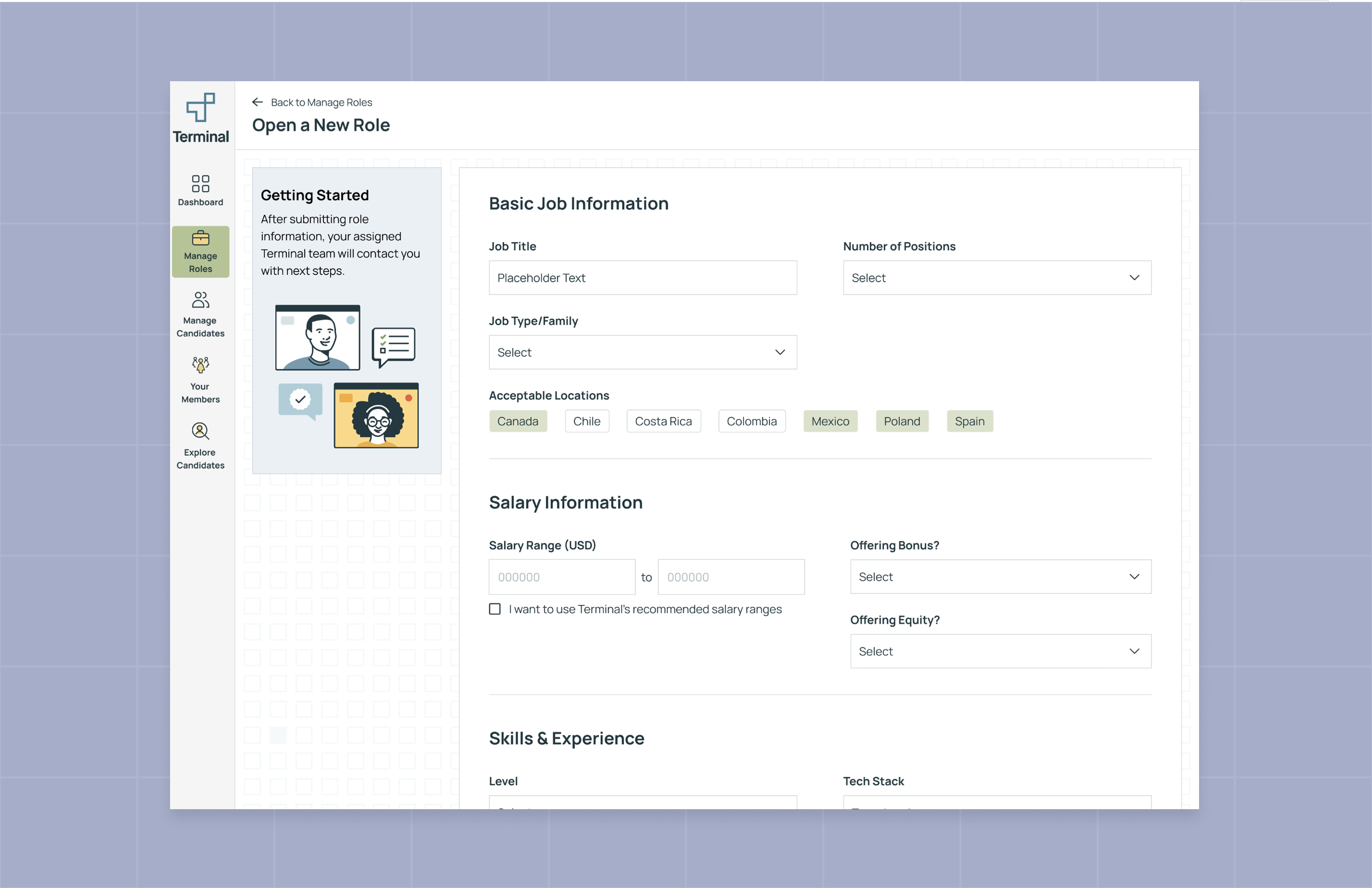
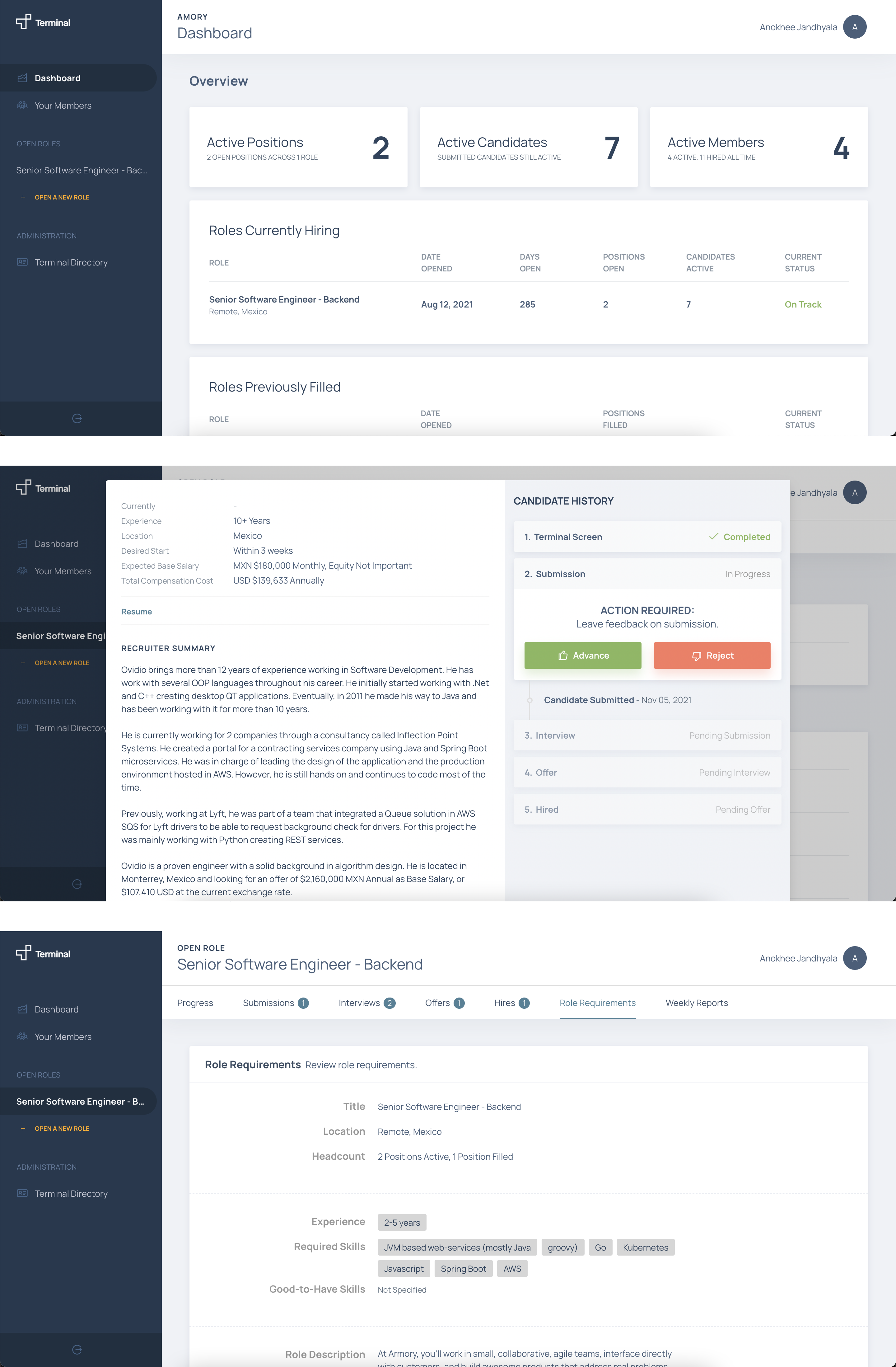
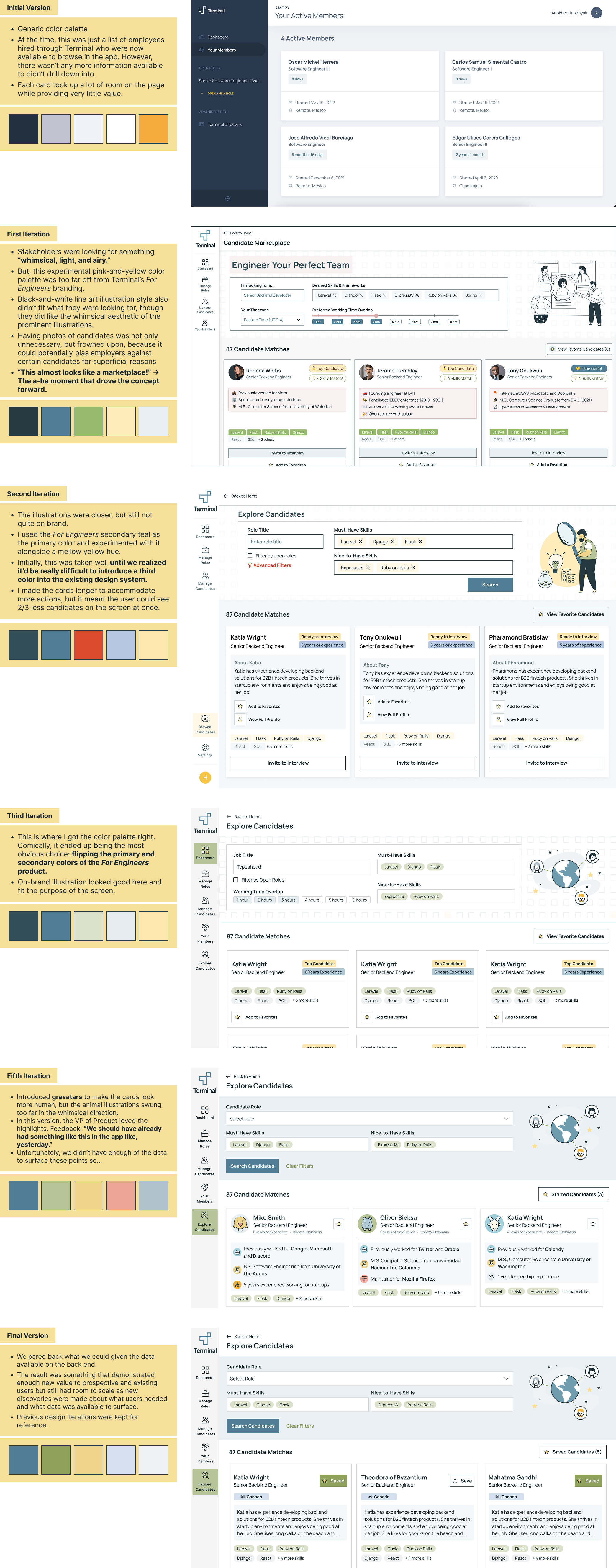
What it Looked Like Before
2. User Insight
Terminal’s customer base was largely startups, where the person responsible for hiring was rarely a recruiter by trade. Depending on company size, it might be a founder, a manager, or an employee juggling multiple roles. To design effectively for this generalist persona, I mapped the entire recruiting journey—from awareness to retention—and focused on the jobs-to-be-done at each stage. This gave us a bird’s-eye view of what Terminal’s B2B experience might be missing, and where new opportunities could exist.
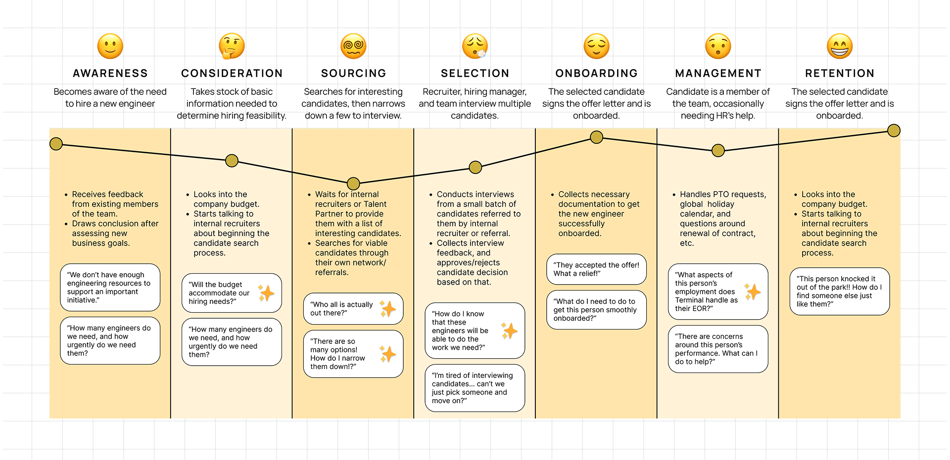
With admin tasks handled internally, customer pain points centered on Sourcing and Selection, with minor ones emerging later in Onboarding and Retention.
3. Factors Contributing to Long Times-to-Fill
- Slow communication: Customers relied on phone and email, where lag times between touchpoints often added days to the hiring cycle.
- Black box process: With little visibility into sourcing, vetting, or candidate quality, customers struggled to trust Terminal’s process.
- ROI uncertainty: Interviews were expensive, and without knowledge of global talent markets, customers and prospects struggled to see Terminal’s ROI.
- Expectation gap: Terminal branded itself as a cutting-edge hiring platform. Customers expected the control and visibility of a domestic recruiter, paired with the speed and expertise of a global platform—something the MVP didn’t yet deliver.
Conceptual Design Process
With a greenfield problem space to explore, my PM and I adopted the Double Diamond method by practicing divergent thinking individually, then converging our strongest ideas together. Even the worst ideas were valuable at this stage because they solidified our product direction.
Turning Point
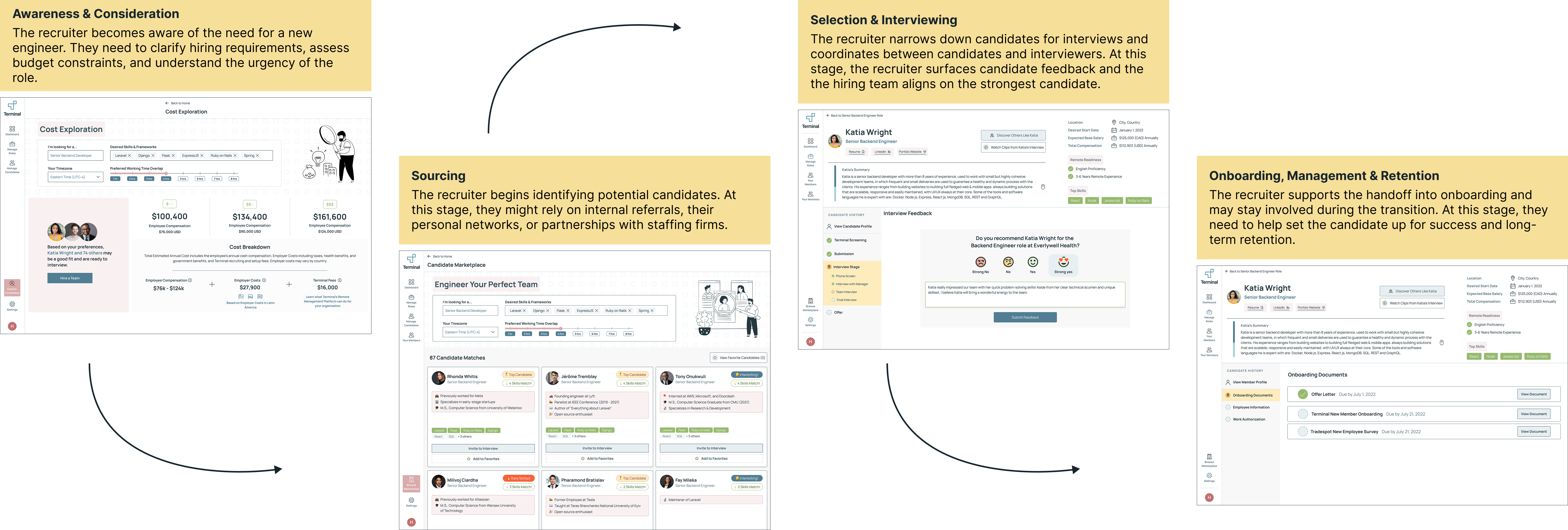
The concept of an advanced candidate search resonated strongly with stakeholders, who saw it as a solution to customers’ biggest pain point: lack of visibility into the talent pool. One executive noted: “This almost looks like a marketplace.”
That comment sparked a lightbulb: Terminal’s product could be positioned less like a static database and more like a dynamic hiring fair where candidates could showcase their strengths, employers felt engaged and in control, and applications never disappeared into a void.
Visual Branding
Concurrently, stakeholders asked me to refresh the B2B interface so it felt light and airy, yet professional and distinct from Terminal’s recruiting platform.
I drew inspiration from the whimsical pastel tones and illustrative style already established on the marketing site, experimenting with directions that carried that personality into the product. Taking an agency-like approach, I presented multiple brand options side by side to highlight tradeoffs in tone and usability.
The most successful direction turned out to be the simplest: reusing the recruiting palette but flipping its primary and secondary colors. This solution gave the interface its own identity while still feeling recognizably on-brand—balancing practicality with fresh visual energy.
Impact
The new platform positioned Terminal as a transparent, engaging, and fast hiring solution. By reframing the customer experience as a marketplace, we turned the product from a passive hand-off tool into a lively, self-service recruiting partner.
Through research-driven discovery, marketplace-inspired concepting, and iterative branding, we shipped a solution that:
- Reduced communication lags and shortened time-to-fill by 40%.
- Increased customer trust and loyalty by providing greater visibility into the hiring pool.
- Differentiated Terminal’s brand identity from others in a competitive market.
Reflections
With so little precedent to build on, I had to balance wide-open exploration with disciplined prioritization.
What I Learned
- Stories drive alignment. The “marketplace” metaphor shaped both the visual design and the user experience, but more importantly, it gave stakeholders a shared mental model. I saw how a strong narrative can rally a cross-functional team around a vision.
- When to use jobs-to-be-done over personas. Our customers were often “recruiting laymen,” so JTBDs provided a more flexible way to capture their needs without forcing them into rigid personas—or designing a UI that assumed they were trained recruiters.
- Constraints fuel clarity. Being asked to explore multiple branding directions was overwhelming at first, but it ultimately led to the simplest, most practical solution: flipping the existing palette. I realized that surfacing constraints early can accelerate the path to the best design.
- Greenfield ≠ anything goes. Starting from scratch was exciting, but tying every idea back to the core business problem (time-to-fill) kept the project grounded and helped us avoid drifting too far into “nice-to-haves”.