Users couldn't easily find who they were looking for.
There was no search or sorting capability, so recruiters had to either use CTRL+F or look for Talent Pool entries nestled inside paginated data.
As Grayscale moved upmarket, our lean EPD team worked tirelessly to scale the platform for new enterprise customers while keeping it usable for existing SMBs.
With multiple features in development and several new hires joining, I realized the strategic intent of PM/PD work wasn't being socialized cross-functionally. As a designer, I knew all too well that failing to publicly communicate the "why" behind our work risked our team’s it getting dismissed as a facelift. However, we didn't have a process to equip customer-facing teams with the product thinking behind the new UI.
To bridge this gap, I created and presented a framework that highlighted the B2B personas we serve and the UX trade-offs we had been making for each. This gave the organization visibility into our design decisions and clarified why certain flows felt different depending on user type.
The framework helped customer-facing Grayscale employees articulate our design philosophy, showing how the platform adapts to distinct user types without compromising simplicity for SMBs.
The consumer-facing persona. These users apply to jobs through AI Chat, WhatsApp, or SMS.
Interfaces for them must preserve conversational flow. In-chat UI or lightweight mobile web tasks, for example, keep them engaged in the task at hand long enough to prevent dropoff.
People who use Grayscale alongside their ATS to complete hiring tasks.
UX Implication: Clean, explainable UI for quick task completion with minimal training.
Automations Setup (Beta)People who own and maintain the system for end users; often in close contact with Support.
UX Implication: Configuration-heavy flows prioritize efficiency over simplicity. Admins are heavily trained and expect dense, flexible controls.
Target User Personas: End Users & Enterprise Admins
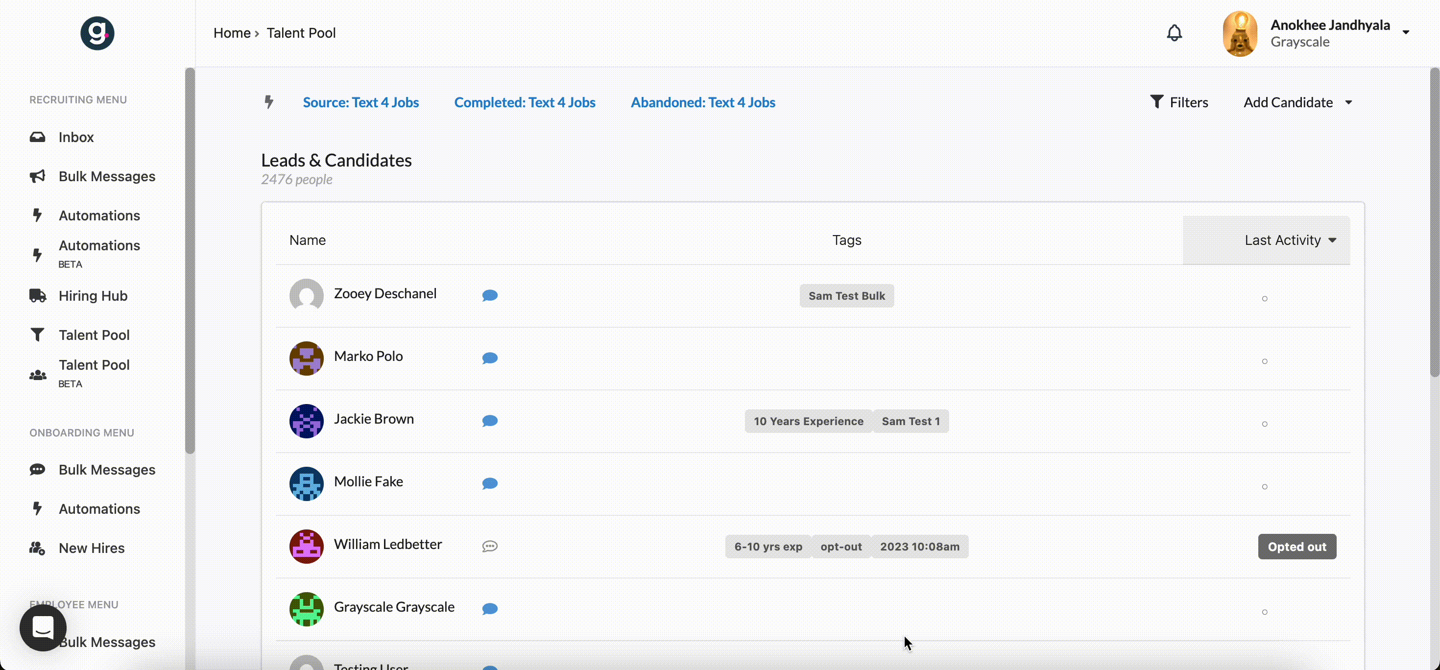
Customers wanted a centralized database of every lead. This included not just past applicants, but anyone who had ever expressed interest in a job. Recruiters needed to quickly locate the right candidates and take action on them.
Because Grayscale functions as a messaging add-on to the ATS (not a replacement for it), the experience had to supplement the flow of recruiters’ primary work. And with many customers hiring for high-volume roles, the database could grow to an astronomical size, making quick discoverability critical.
There was no search or sorting capability, so recruiters had to either use CTRL+F or look for Talent Pool entries nestled inside paginated data.
Tables crammed multiple data points into single cells, making them difficult to scan or export cleanly.
Not only did filtering use an unusual, nonstandard pattern to build complex queries, it wasn’t filtering on fields users would find useful.
Candidates could be added to lists for easier organization, but the list feature was inaccessible from anywhere else in the application.
The old filtering system allowed for duplicate filters.
Structured, export-friendly tables: Each data point was separated into its own cell, improving readability and enabling clean CSV exports that matched what users saw in Grayscale.
Configurable data columns: Users could choose which fields mattered most to them and hide the rest. This reduced overwhelm and gave different personas the power to surface only the fields they found most important without us having to design for edge cases based on persona or org size.
Instant searchability: A dedicated search bar allowed recruiters to find candidates by name, email, or keyword in seconds.
Advanced filtering: Searchable, multi-select filters with include/exclude logic and intuitive presentation replaced the old filters, making it easy to refine thousands of candidates into relevant subsets.
Segmentation & tagging tools: Recruiters could now save groups, apply dynamic tags, and build lists to power automations such as outreach campaigns.
Note that the new Talent Pool is still in beta. To avoid violating my confidentiality agreement, I won't post a screenshot of it until after GA release.
Whether they were searching for a single candidate or building a segment of targeted candidates to run automations against, recruiters could find them within seconds using their Talent Pool.
Target User Personas: Enterprise Admins
For context, Gracie is the AI personification of Grayscale’s automated messaging product.
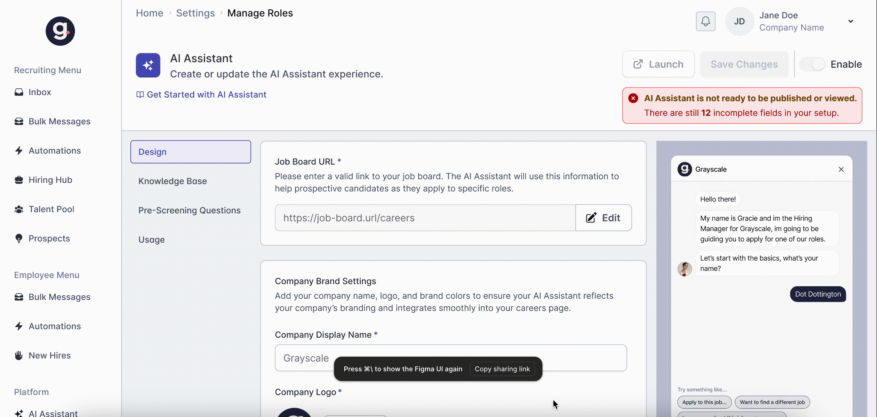
Enterprise admins relied on support and engineering for simple updates to their instance of Gracie, like changing its name, adjusting brand colors, updating FAQs, or tweaking tone. This revealed an opportunity to reduce the support tickets by giving admins more power over their AI Assistants.
Guided UX Copy: Since there were so many setup configurations, it would be easy for even the most knowledgeable admin to get lost in a long form. These settings required a clear menu that mapped each step to a part of Gracie’s behavior or appearance, so users could quickly find what they needed.
Familiar Flow: Inline explanations clarified what each option controlled and the downstream effect of a change, reducing uncertainty.
Available Tech: A preview → save → deploy pattern mirrored common enterprise tools, lowering the learning curve for busy recruiters.
Segmentation & tagging tools: Permissions were structured to ensure that admins could preview and publish changes quickly, reducing turnaround time from days to minutes.
I designed a self-service configuration flow that was easy to navigate and gave customers direct control over Gracie’s everyday settings while preserving white-glove support for complex needs. My guiding principle was to empower admins while maintaining Grayscale’s white-glove support model.