Few Established Patterns
Novel AI chat–driven applications lack established UX norms.
Grayscale is a B2B hiring platform that integrates with customers’ ATS to automate high-volume recruiting tasks. At its heart lives an AI Assistant named Gracie.
When I joined, Gracie was an informational chatbot customers could embed on their careers sites. Over time, she grew into a robust hiring assistant – guiding prospective candidates through applications, texting them on their preferred channel, and even acting as their main point of contact through complex recruiting flows at enterprise scale.
As the sole UX Designer, I worked with the PM, VP of Product/Engineering, CTO, and developers to translate Grayscale's rapidly evolving AI-powered capabilities into intuitive interfaces.
U.S. job applications are required to collect voluntary demographic data using a protected EEOC questionnaire. In order for Grayscale to maintain compliance, this questionnaire has to appear at some point during Gracie's application process.

Although I had some access to B2B users, I didn’t have direct insights from candidates using Gracie. Still, I wanted to ground my design decisions in research before diving in.
As with any new technology, AI raises a lot of suspicion. Given the novelty of a chatbot-driven job application process, I wanted to tread lightly to avoid alienating users who might already feel uneasy.
It’s well-documented that minorities sometimes alter their names on résumés to appear “less foreign” and reduce the chance of discrimination. This led me to hypothesize that marginalized candidates might be especially cautious — even distrustful enough of demographic surveys to abandon their applications.
To validate my hypotheses, I relied on secondary research methods: exploring job-hunting forums, reviewing candidate discussions, and conducting competitive analysis. I examined how well-known companies integrated surveys, secure uploads, and compliance widgets into their chatbot flows.
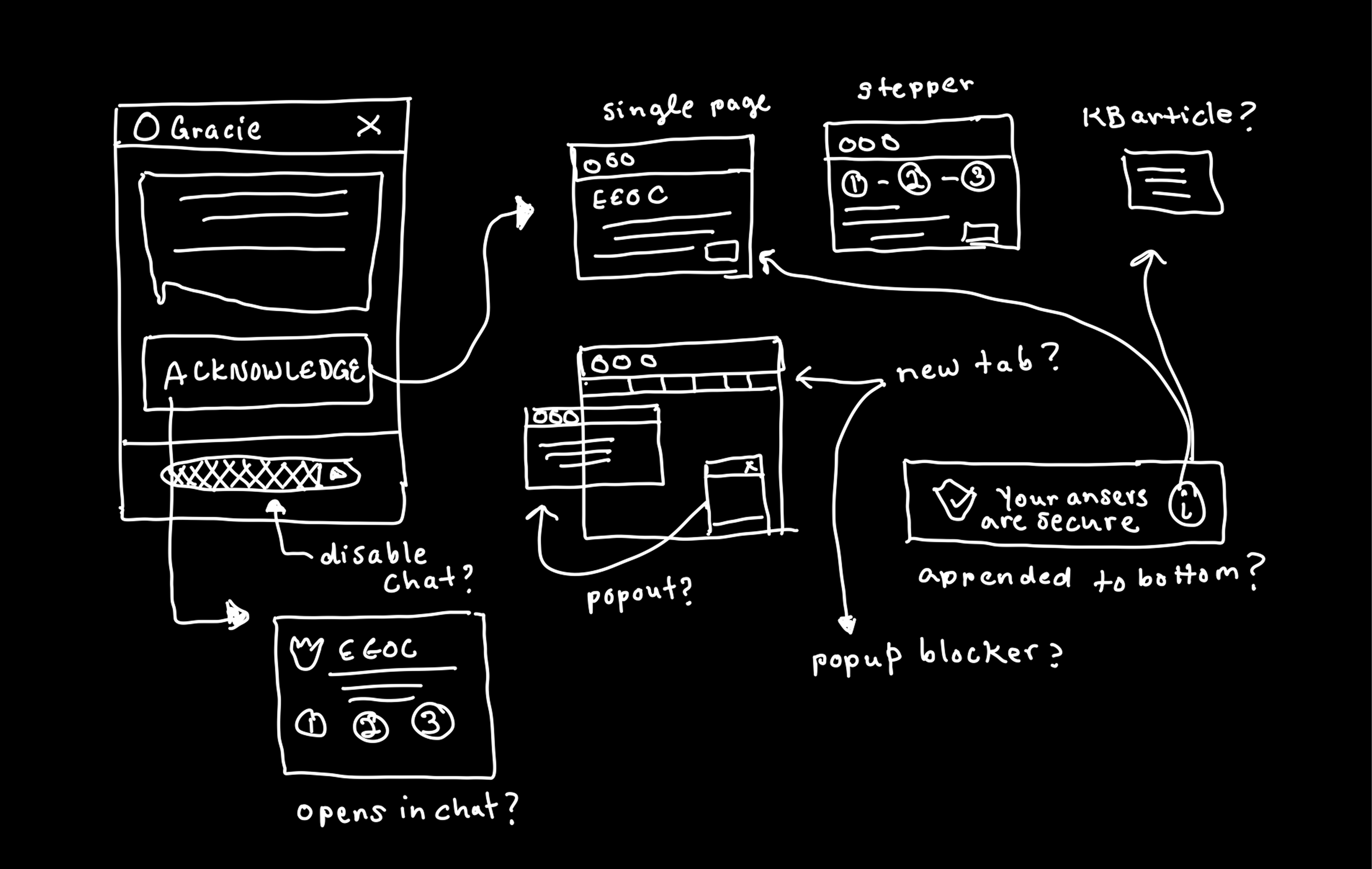
Novel AI chat–driven applications lack established UX norms.
Opening surveys in pop-ups or tabs causes confusion and drop-off.
Dense EEOC jargon might feel overly formal and spook candidates at the end of their applications.
Pop-ups often blocked on public computers, making this process exclusionary to applicants who may not own their own computer.
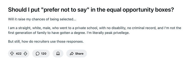
Candidates of all backgrounds fear their answers to demographic data questions will affect hiring outcomes.

While trying to confirm my hypothesis, I learned that fear of job discrimination is quite common among Reddit users who identify as white males. If even the self-proclaimed “peak privelleged” among us doesn’t trust EEOC questionnaires, that’s a UX problem!
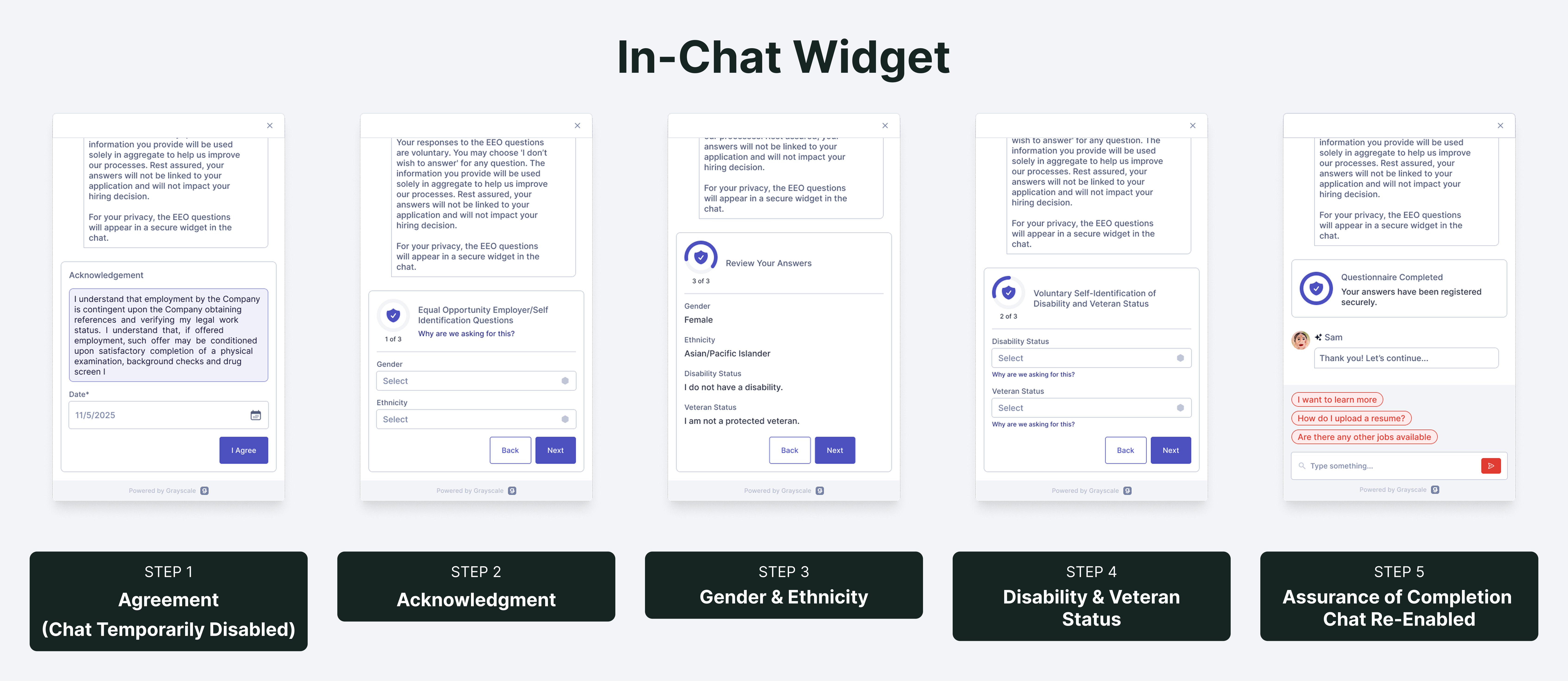
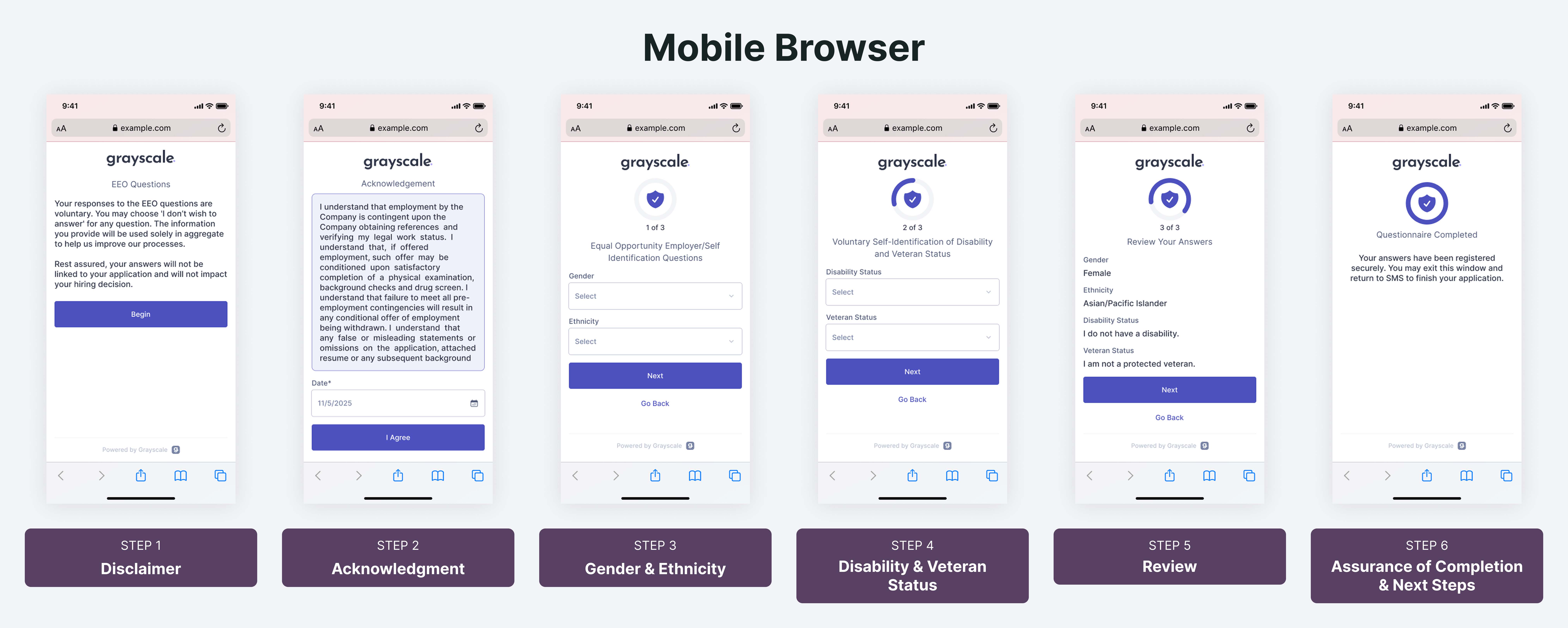
Stepped Form: Rather than overwhelming candidates with a wall of dense legal text, the survey followed a stepper format. Each step contained only one or two questions, keeping the interaction lightweight and providing a sense of progress.
Signals of Trust: Before opening the survey, Gracie reassured candidates in plain language that responses were voluntary and had no impact on hiring outcomes. Inside the flow, an official EEOC disclaimer and shield icon reinforced privacy and compliance. Informational copy linked out to EEOC documentation for candidates who wanted more detail.
Tone Shift for Security Once the EEOC widget opened, Gracie’s conversational voice paused and shifted to a more formal, secure tone. This contrast underscored that demographic answers were confidential and treated differently than general chatbot interactions.


My design allowed candidates to complete EEOC surveys securely across all channels, while preserving conversational flow and strengthening trust in Gracie. This work helped Grayscale to maintain compliance at enterprise a scale of up to hundreds of millions of applications processed through the platform, and contributed to improved completion rates, averaging around 25% from application start to finish.